01
Audit before pixels
A UX audit of the product pointed to the friction behind low engagement, and gave the redesign a clear order of priorities.

Find the root cause of low user engagement, then redesign the key product features to make tubics easier to use — and more sticky.
A UX audit of the product pointed to the friction behind low engagement, and gave the redesign a clear order of priorities.
The information architecture was reorganised around what teams actually do every week, so the most valuable features are one click away.
Colours, components and patterns were documented as tubics’ first design system, so new features ship consistent by default.
I ran a UX audit of the product to identify the root causes of low engagement. Its findings set the priorities for the redesign: which features mattered most, and where the information architecture got in the way.
I led the redesign of the key product features — from keyword rankings and share of voice to video optimisation — creating new UI elements and reorganising the information architecture to improve usability and engagement.
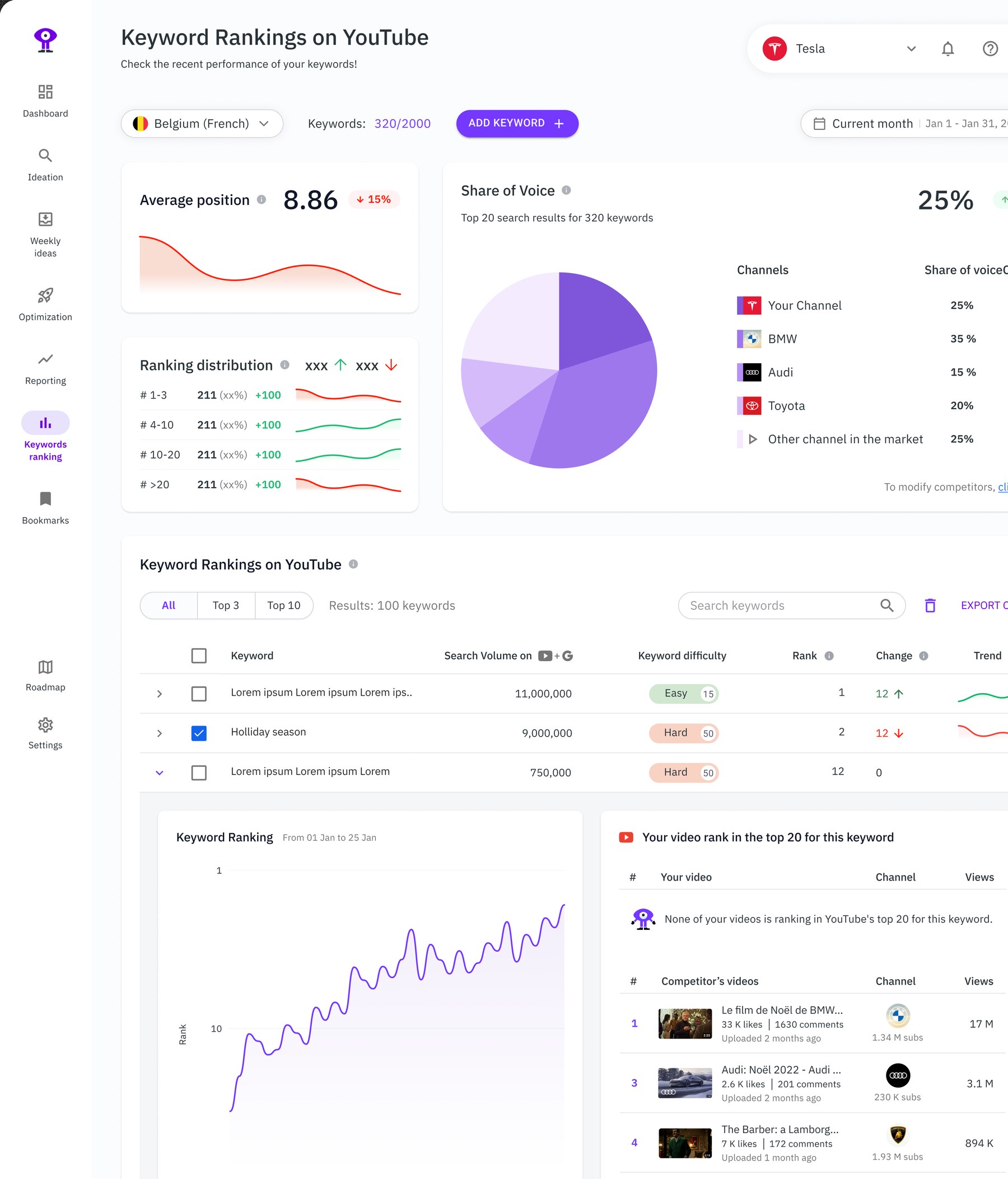
Average position, ranking distribution and share of voice against competitors at a glance — then down to each keyword, its trend and the competitor videos ranking for it.
To keep the product consistent as it grew, I established the foundation of tubics’ first design system: a comprehensive set of guidelines, UI components and patterns that the team uses to stay coherent across every feature.
“Edmond significantly enhanced our user experience at tubics through the redesign of the UX/UI and the design of some new features. His reliability and deep expertise in design and usability testing made the process smooth and efficient. For startups seeking to elevate their product quickly without compromising quality, Edmond is the right partner.”
 Matthias Funk
Co-founder & CEO, tubics